CREATIVE DIRECTION + BRAND MANAGER
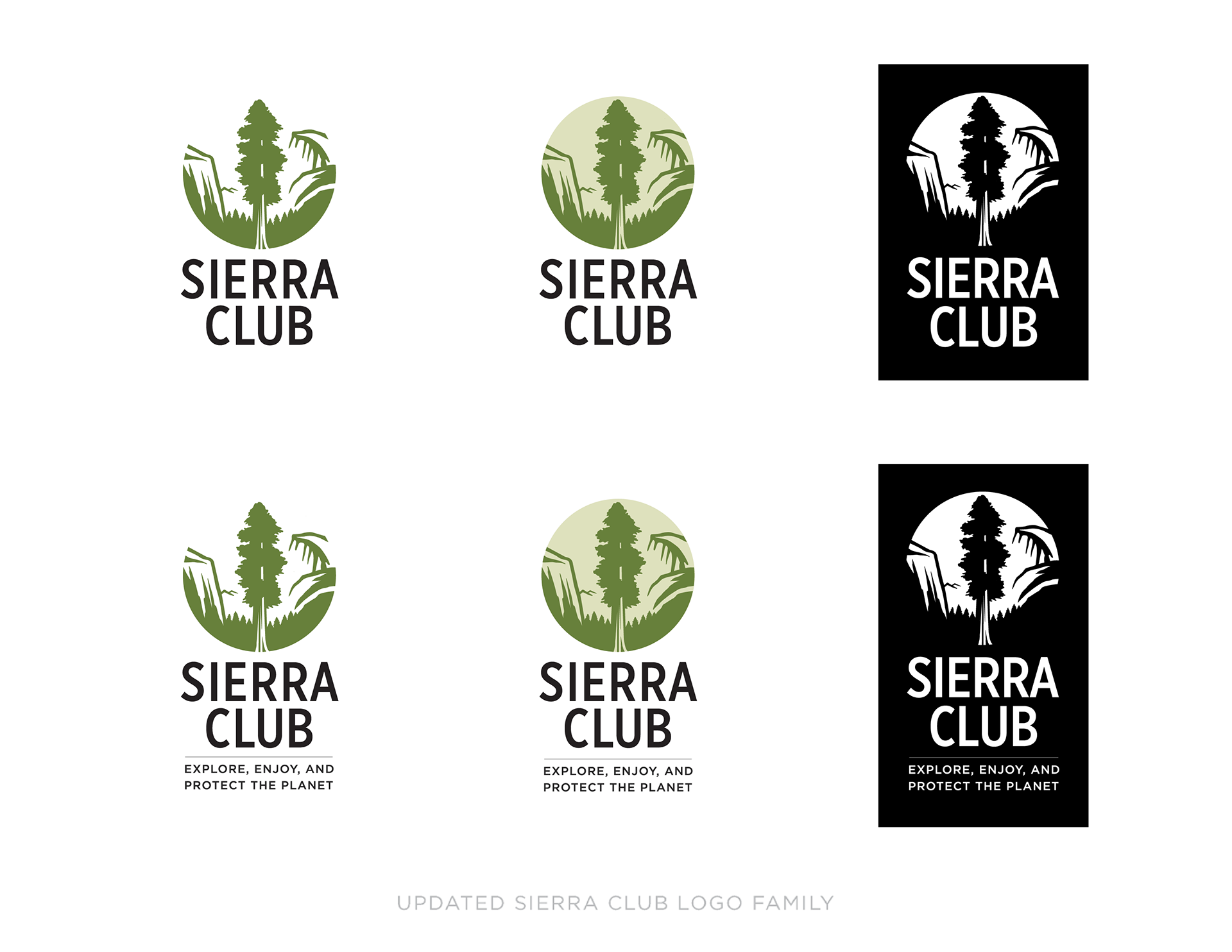
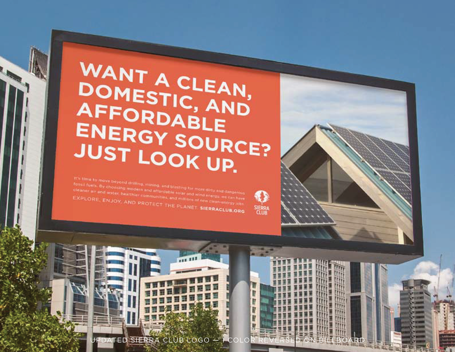
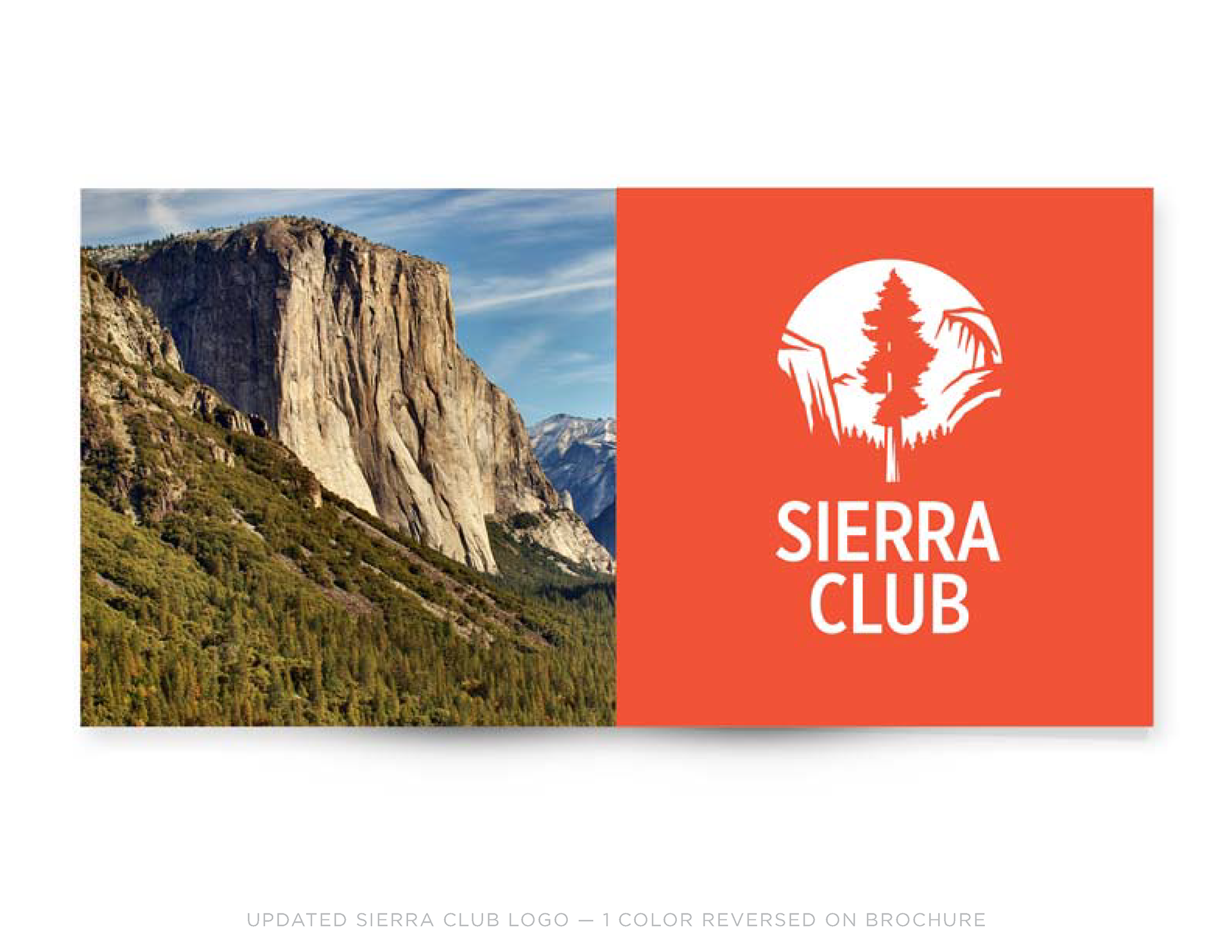
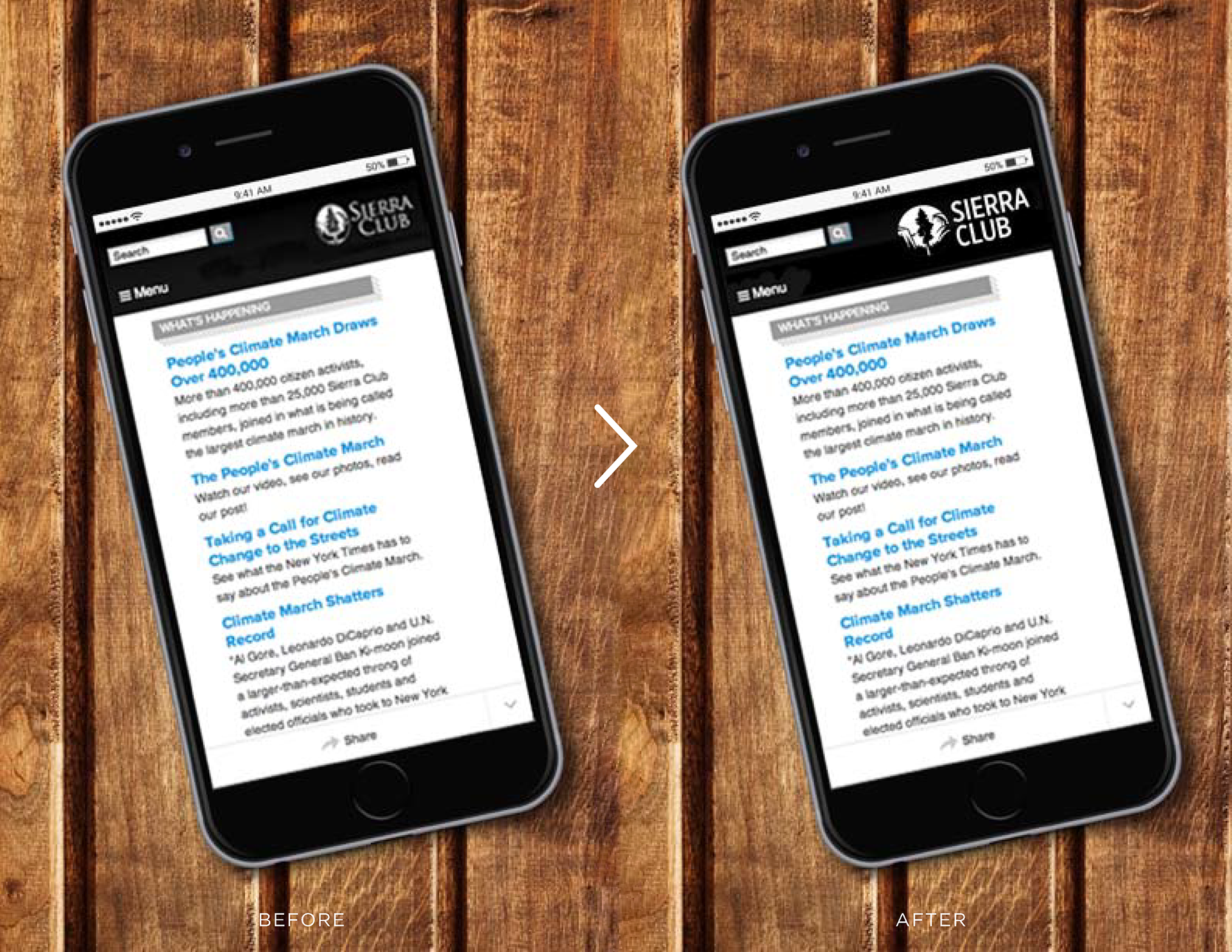
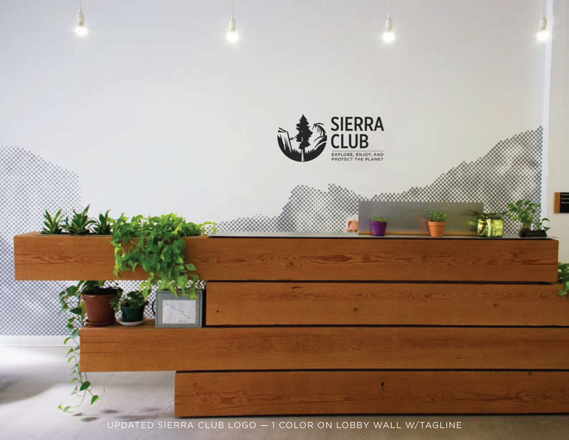
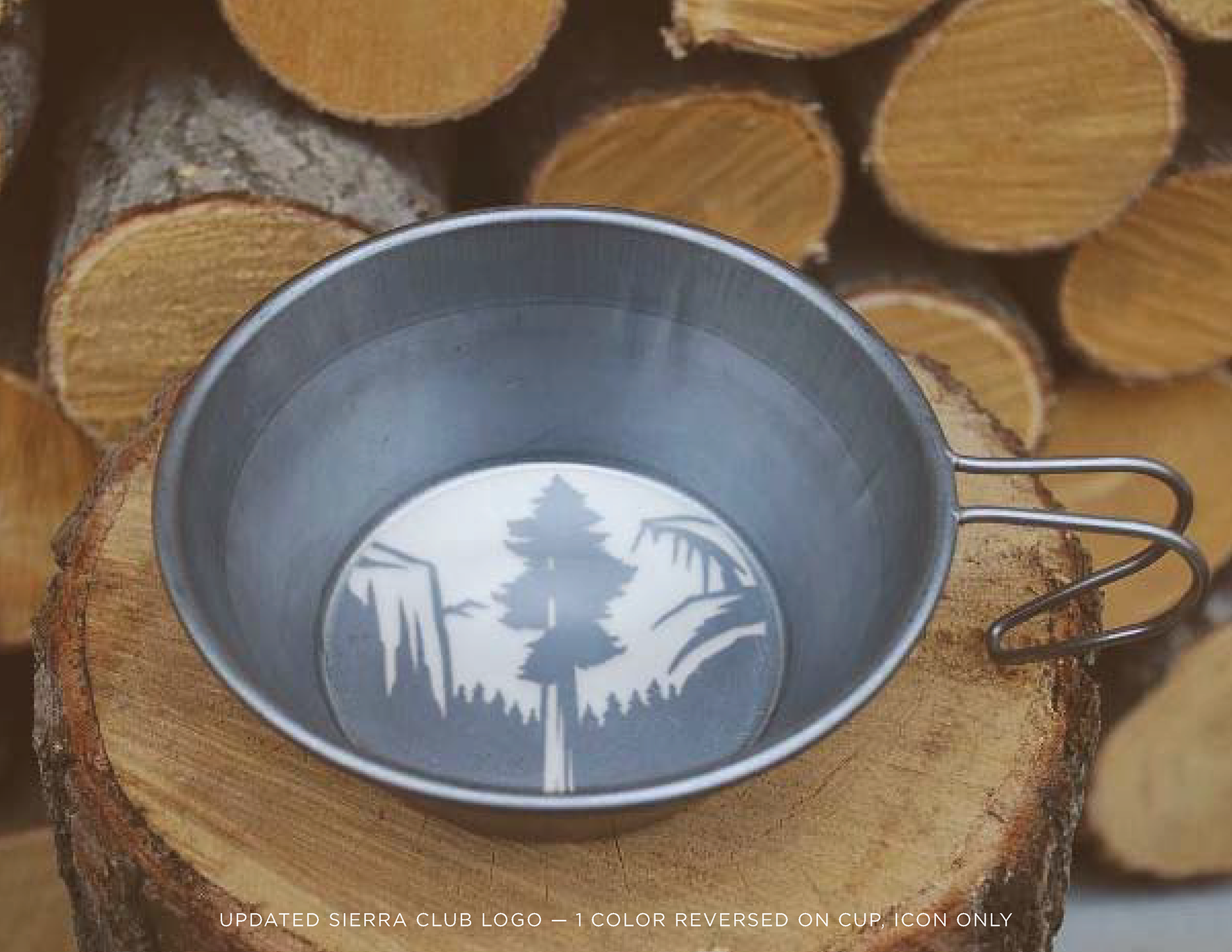
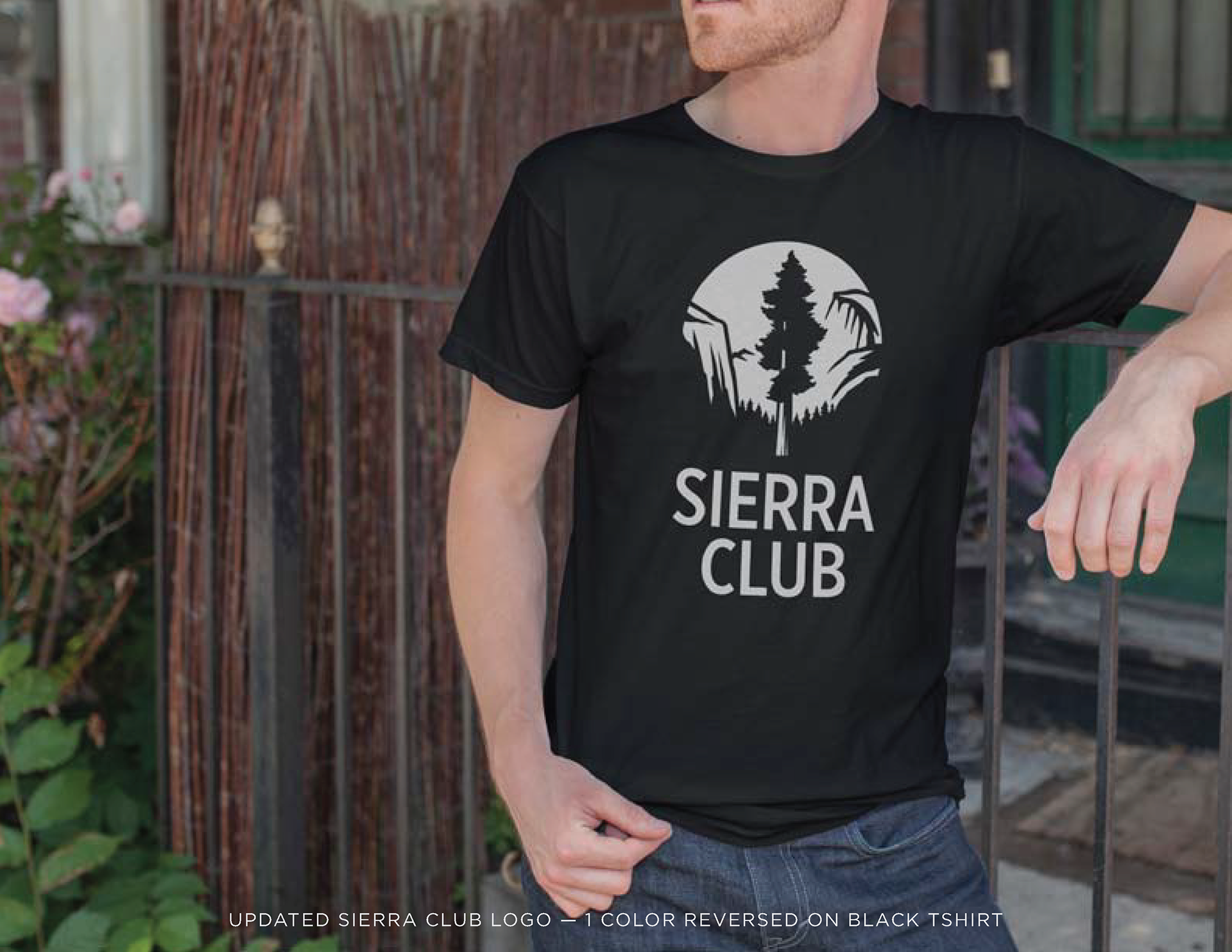
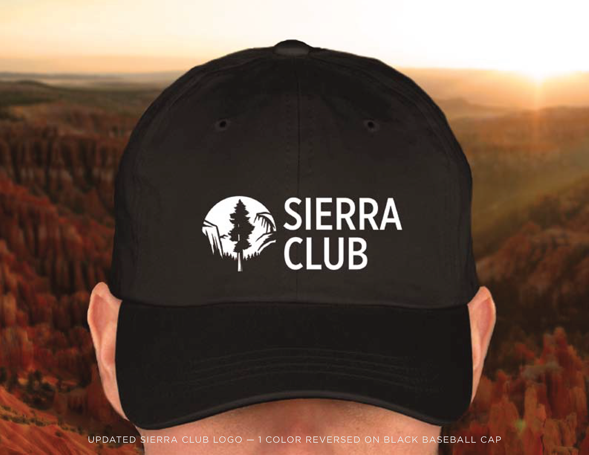
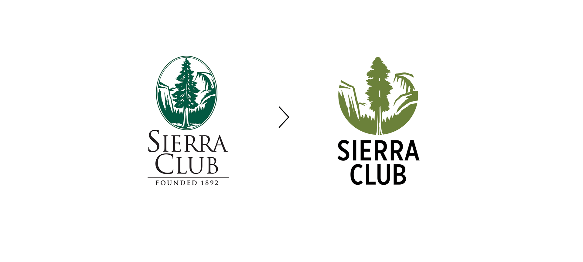
When I started at the Sierra Club, I inherited the organizational logo from the 1980s. A typeface that was too thin and an overly detailed woodcut icon made everything we applied it to instantly look dated. I knew that an estimate and proposal process would cost a lot of time and money, so we took on the logo redesign inside our in-house design studio between our daily campaign deadlines. To make the process smooth and efficient, we stuck with the original sequoia tree in Yosemite Valley for the logo illustration. The objective was to make the new logo bolder and cleaner so it would read better in the online world —including on small mobile devices. This national logo design has now been utilized across the Sierra Club’s 64 regional chapters as well as across all internal departments. I’d probably still be waiting for budget approval if I had done it through the “correct” process.
Outcome
The logo design didn’t cost anything but studio time and will be used for years to come by the oldest and largest environmental group in the U.S.